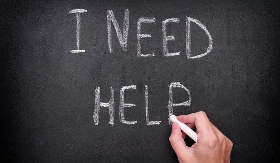
HELPY:
a mobile app designed to integrate the multilingual communities in Brussels
SECTOR:
Government
PROJECT SCOPE:
The idea was pitched to the Flemish Government in 2015 by a startup company. The main stakeholder came to me in order to develop a mockup of the application. The concept “bringing communities together in multilingual cities based on specific needs” was the starting point of the app. They pitched in Brussels to the Flemish government, but in the end took off overseas with the app in Quebec.
MY ROLE:
Based in the basic idea of the app, we finalized in 4 months a final mockup of the app, including the monetizing model with in-app purchases. The mockup of the app served to get more funding.
METHODOLOGY:
Over 4 months various workshops were held to gather all the needed info:
(1) the definition of the app, user requierements, user research.
(2) User flow & wireframes
(3) DNA of the app: branding & voice
(4) Final presentation of the “branded” app, together with the presentation of the monetizing model.
PART 1: Defenition of the app
The objectives & goals of the app as well as the underlying in-purchase business model were clear as from the frist meeting. The main challenge of the app was to find the right “necessity categories” or “pain points” of living in a multilingual city and not speaking all the languages. The main idea was to enchance the help between neighbours of the same appartment building regarding these 3 needs: homework, legal papers & post, and language exchange chats.
The app had to be relevant for Belgium where the 3 language communities live closely together in Brussels capital.
PART 2: User research
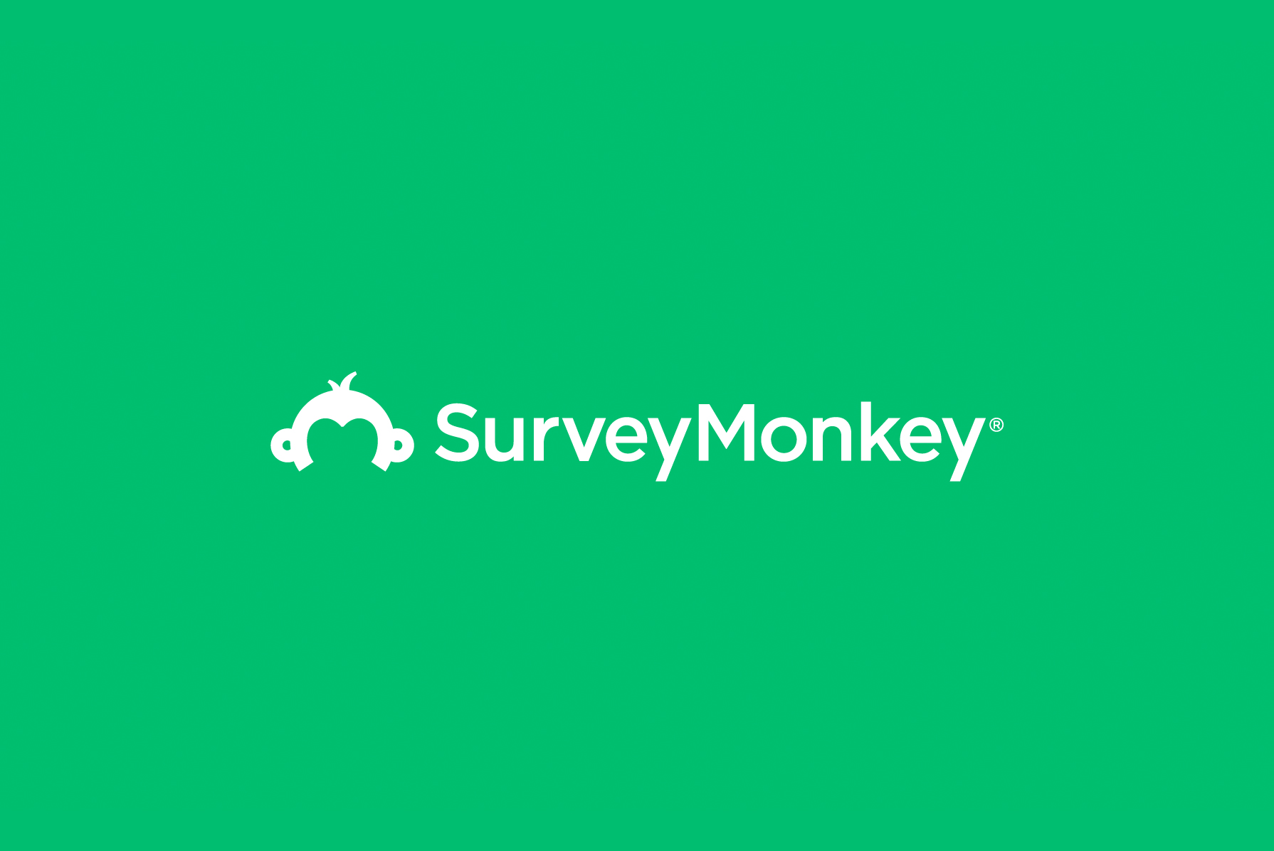
A list of “categories of help” were determined and were discussed with a pool of 15 people in the network of the stakeholders. A variety of people with different backgrounds, speaking Dutch, French, both or any other languages were asked to participate in a survey. A popular tool at that time was Survey Monkey.
The results of the survey made it clear which categories were “must have” and which were “nice to have”. As well, the results made us realize that only the “mobile generation” were seeing the advantages/ utility of this app. Older people who were part of the target group of the app, would be left out, as they were not “mobile active”.
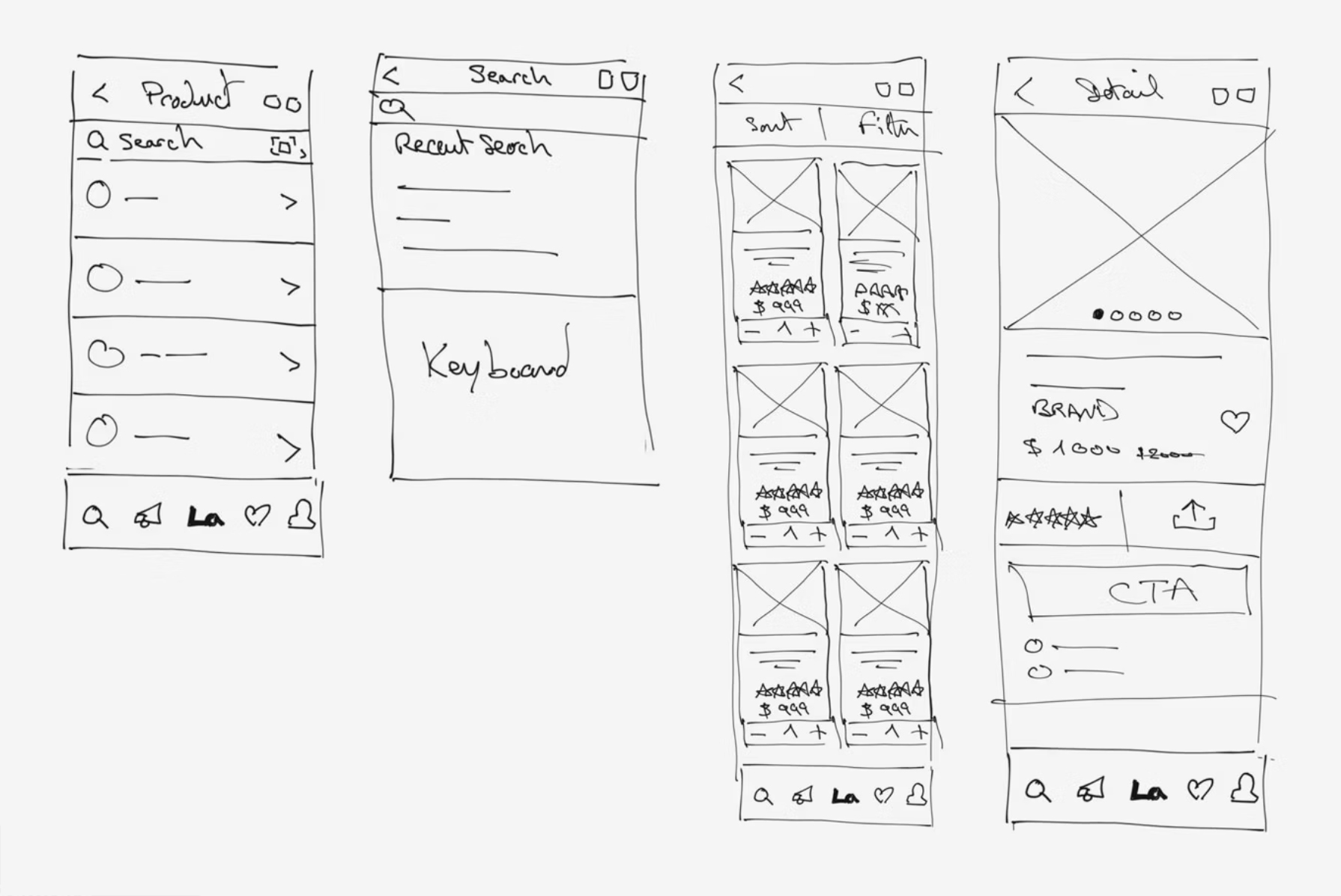
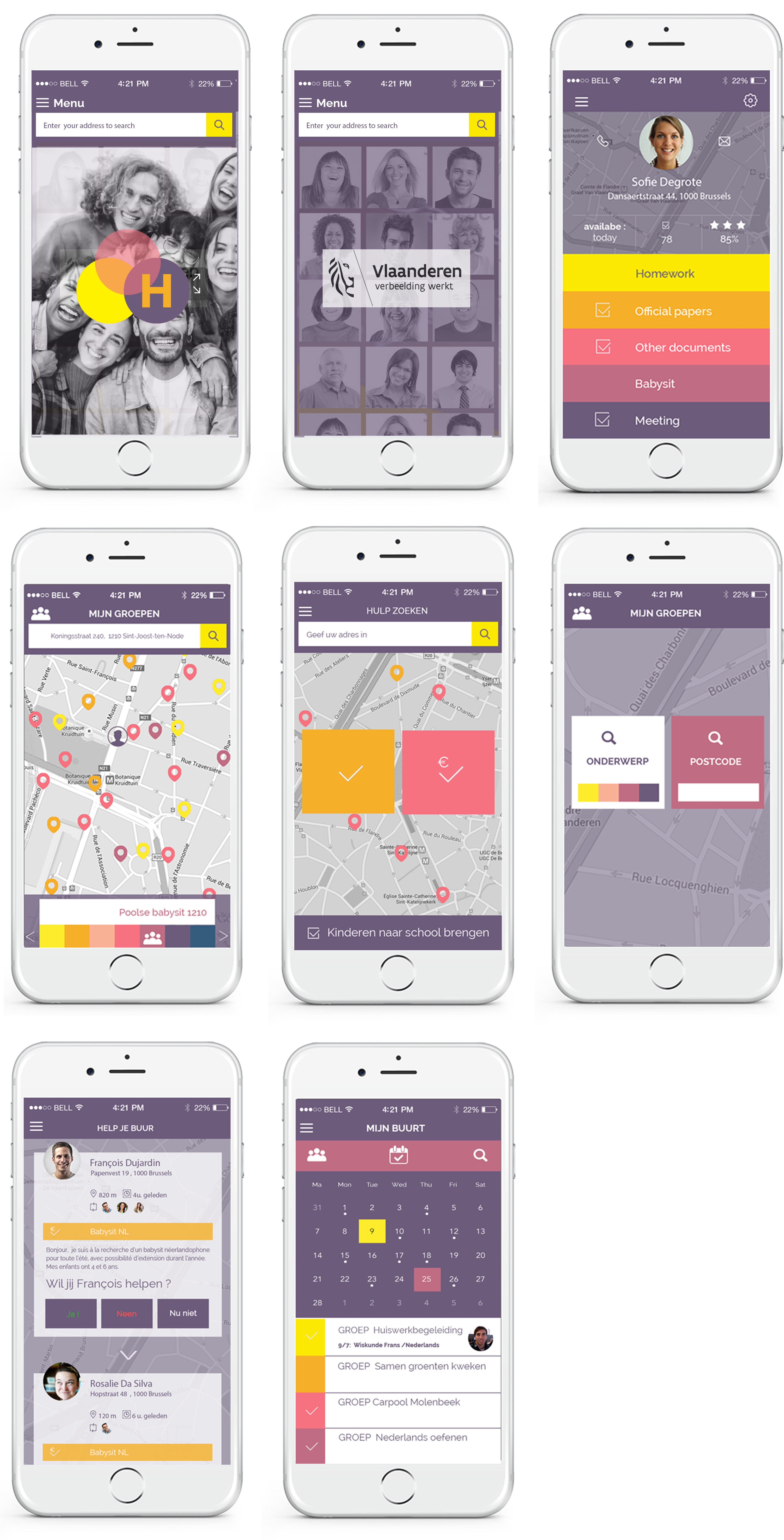
Part 3: Wireframes
Back then, wireframes were sketched in pencil, then converted to wireframes made in Illustrator. There would be a web version and a mobile version. The site and mobile app had different functionalities.
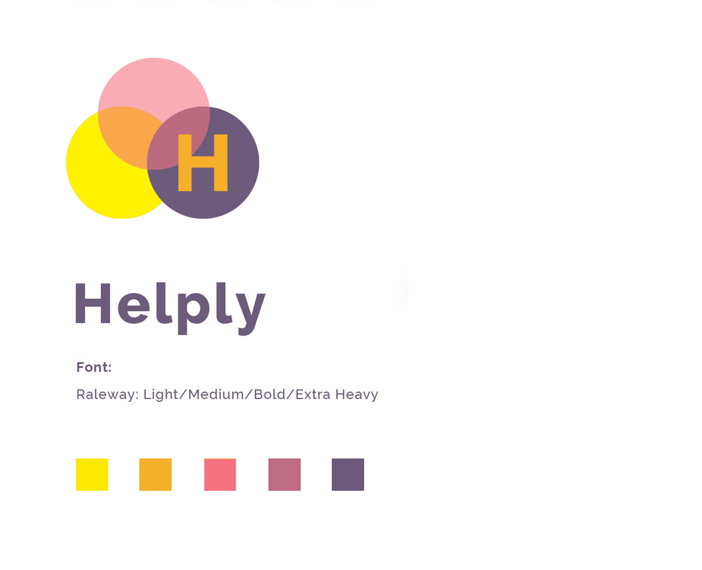
Part 4: Branding
The branding needed to be a “system” which could be applied to other versions of the app for example in other multilingual countries or cities in the world. As such we chose an open identity system, where the shapes and the first letter of the app would remain the same, but colours and symbols would be different. This system was the base “DNA” of the app and made “duplication” easy.
In the end, the startup company launched the app in Quebec.
Part 5: Mockup of the app
During a full day workshop the branded MVP was presented to the startup company. In 2015, it was not a clickable MVP but a presentation of the branded wireframes.
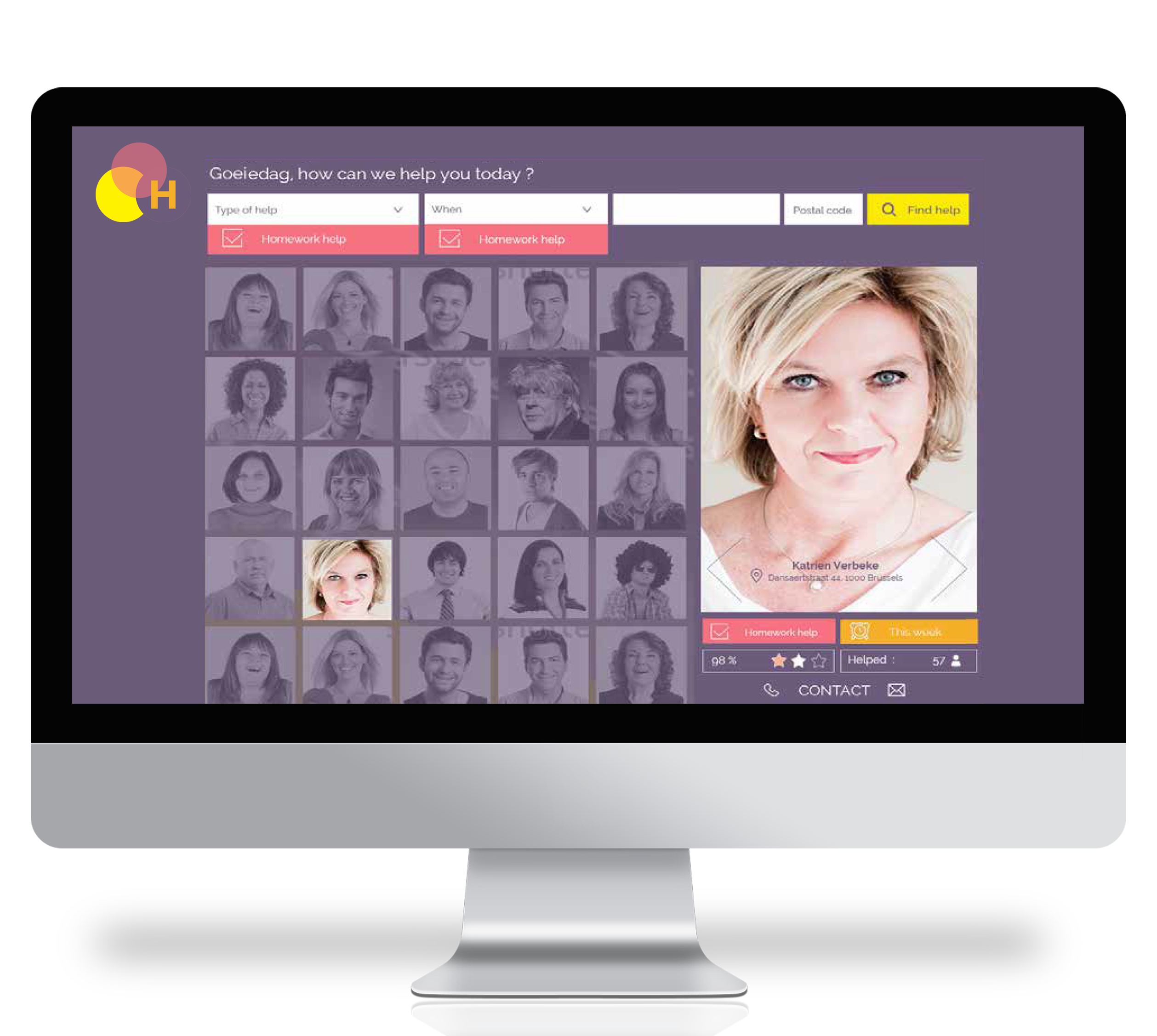
Part 6: Web app, landing page for the app & more
The final step was the creation of the landing page for the app and a mockup of the web version of the app, in order to get more funding from investors and stakeholders.
As extra, they asked us to analyse and validate the in-purchase features of the app as part of their monetizing strategy. We did a marketing & SWOT analysis mainly based on the US app “Neighbors”.
 rk
rk